
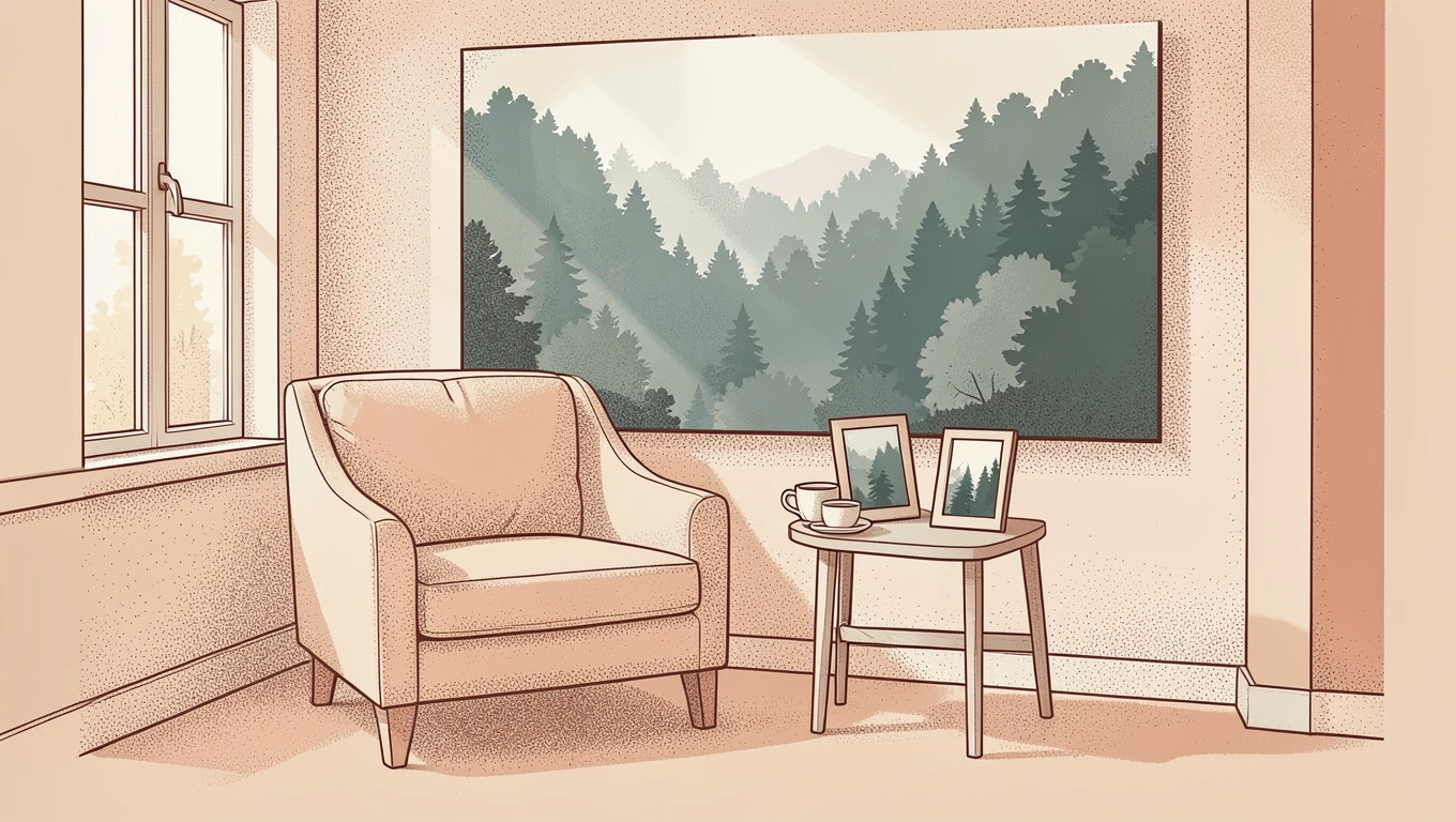
Bringing a forest landscape print into your home can transform a space from busy and stressful to peaceful and grounding. The right image invites your eyes to rest, your shoulders to drop, and your mind to wander somewhere quiet. But not every forest print delivers that sense of calm. Some feel too busy, too bright, or just off in ways that can leave a room feeling more cluttered than serene. The key is knowing what to look for in composition, color, scale, and mood so the art you choose becomes a true retreat rather than just another thing on the wall.
Start with Color Palette and Tone
The colors in your forest print set the emotional tone of the entire room. Muted greens, soft blues, and earthy browns tend to evoke tranquility because they mirror the natural world in its quietest moments. Think of a forest at dawn, wrapped in fog, or dappled afternoon light filtering through leaves. These palettes feel gentle on the eyes and help lower visual stimulation, which is exactly what you want in a calming space.
Avoid prints dominated by overly bright or saturated colors. A forest scene with neon greens, electric blues, or high-contrast shadows can feel energizing rather than soothing. That might work beautifully in a creative workspace or playroom, but it works against the goal of calm in a bedroom, reading nook, or meditation corner. Instead, look for prints where the tones blend softly into one another. Gradients and subtle shifts in hue create visual harmony, allowing your mind to settle rather than constantly search for the next point of interest.
Consider whether the print leans warm or cool. Warmer earth tones like amber, rust, and golden greens can feel cozy and grounding, perfect for spaces where you want to feel wrapped up and safe. Cooler tones like soft grays, misty blues, and sage greens tend to feel more expansive and airy, ideal for smaller rooms where you want to create a sense of breathing room. Both can be calming, it just depends on the specific mood you are trying to build.
Composition and Visual Flow Matter
How a forest scene is composed affects how your eye moves through the image and how your nervous system responds. Prints that depict deep, dense forests or pathways leading into the distance create a sense of depth and escape. Your gaze follows the path or peers into the shadows, inviting a moment of mental wandering. This kind of gentle visual journey encourages relaxation because it mimics the experience of actually walking into nature.

Look for compositions with soft, diffused light or a misty atmosphere. When light is harsh and direct, it creates sharp contrasts and high energy. When it is filtered, foggy, or just beginning to break through, the image feels quieter. Mist softens edges and blurs detail, which reduces the amount of visual information your brain has to process. That reduction is what allows a print to feel restful rather than demanding.
Avoid chaotic compositions. If the forest is a tangle of branches, dense underbrush, or a riot of competing focal points, your eye will not know where to land. That visual confusion translates into a low-level stress response, the opposite of what you are trying to achieve. Instead, choose prints with clear structure: a central path, a grouping of trees with space between them, or a single focal point like a clearing or a beam of light. Simplicity in composition almost always wins when calm is the goal.
Next Level: Place your forest print across from seating or at eye level when lying down. This positioning lets you look at the image without effort, allowing it to do its work during moments when you are already trying to relax or unwind.
Scale and Proportion in the Space
The size of your print relative to the wall and the room plays a big role in how calming it feels. A large, commanding piece can create a focal point that anchors the room and draws you in, almost like a window opening onto another world. This works especially well on a feature wall behind a bed, above a sofa, or in a space where you want the art to be the main event. When done right, a large forest print can make the room feel more spacious and open, as if the forest itself is an extension of your living area.
Smaller prints offer a subtler, quieter presence. They work beautifully in groupings or as part of a gallery wall, adding layers of calm without overwhelming the space. A small forest scene on a bedside table, a narrow hallway, or tucked into a reading corner can feel intimate and personal, like a little secret spot you have created just for yourself. The key is to keep proportions balanced. A tiny print on a massive wall can feel lost and disconnected, while an oversized print in a cramped room can feel oppressive.
Consider the room’s layout and sightlines. If the print will be viewed from a distance, go larger so the details remain visible and the impact carries. If you will be close to it most of the time, a smaller, more detailed print can reward closer inspection without feeling too busy. And remember that the frame matters too. A thick, ornate frame can shrink the perceived size of the image and add visual weight, while a slim or borderless frame lets the forest itself take center stage.
Framing and Finish to Complement the Theme
The frame you choose either supports the calming quality of your forest print or distracts from it. Natural wood frames are a classic choice because they echo the organic material of the forest itself. Light woods like ash, birch, or oak feel clean and modern, while darker woods like walnut bring warmth and richness. Both can work beautifully as long as the frame does not compete with the image for attention.
Simple, unobtrusive frames tend to work best for calm spaces. Thin black or white frames offer a minimalist touch that lets the forest scene breathe. If you prefer no frame at all, consider a canvas wrap or a print mounted on wood. This frameless approach can feel more immersive, as if the forest is floating on your wall rather than being contained within boundaries.
The finish of the print itself also matters. Matte finishes reduce glare and reflection, which keeps the image soft and easy on the eyes. Glossy finishes can add vibrancy and depth, but they also catch light and create reflections that can be distracting, especially in rooms with lots of natural light or overhead fixtures. For calm, matte almost always wins. It keeps the focus on the content of the image rather than the surface.
Q&A
What type of forest scene is most calming?
Scenes with soft, diffused light, muted colors, and clear visual pathways tend to be most calming. Look for misty forests, early morning light, or images with a sense of depth and quiet. Avoid overly bright, chaotic, or densely tangled compositions that make the eye work too hard.
Should I choose a horizontal or vertical forest print?
Horizontal prints tend to feel more restful because they mirror the natural horizon line and encourage a relaxed, side-to-side scan. Vertical prints can create a sense of height and openness, which works well in rooms with low ceilings or narrow walls. Choose based on your wall space and the mood you want to create.
Can a forest print work in a small room?
Absolutely. A forest print with cool tones and a sense of depth can actually make a small room feel larger by drawing the eye into the image and creating the illusion of space. Just keep the scale proportional and avoid overly dark or dense images that might close the room in.
What if my room already has a lot of color?
Choose a forest print in neutral or muted tones that complements rather than competes with your existing palette. Soft greens, grays, and browns are versatile and tend to blend well with most color schemes. If your room is bold and colorful, a quieter print can serve as a visual resting place.
For Conclusion
Choosing a forest landscape print that truly calms a room comes down to understanding how color, composition, scale, and framing work together to shape mood. The best prints do not shout for attention. They invite you in, offer a moment of quiet, and remind you that peace is something you can build into your everyday surroundings. It is not about finding the most dramatic or striking image. It is about finding the one that makes you breathe a little deeper when you walk into the room.
Trust your instincts. If a print makes you feel restless, overstimulated, or visually overwhelmed, it is not the right choice, no matter how beautiful it might be in theory. The right forest print will feel like a gentle companion, something that grounds you without demanding anything in return. That is the kind of art that earns its place on your wall and makes a room feel like home.